
Components
Turn any HTML <input> into an as-you-type search box over one of your lists or groups — type “run”, see “running shoes”.
@searchstack/autocomplete— a tiny JavaScript module for any framework, or none. On npm, and prebuilt on a CDN.- Built in — waits for a pause in typing, drops out-of-date replies, handles the arrow keys, goes full-screen on phones, remembers recent choices, draws each row from your template.
- Optional — it only calls the
suggestendpoint, which you can call from any language or platform.
What you get for two lines of code
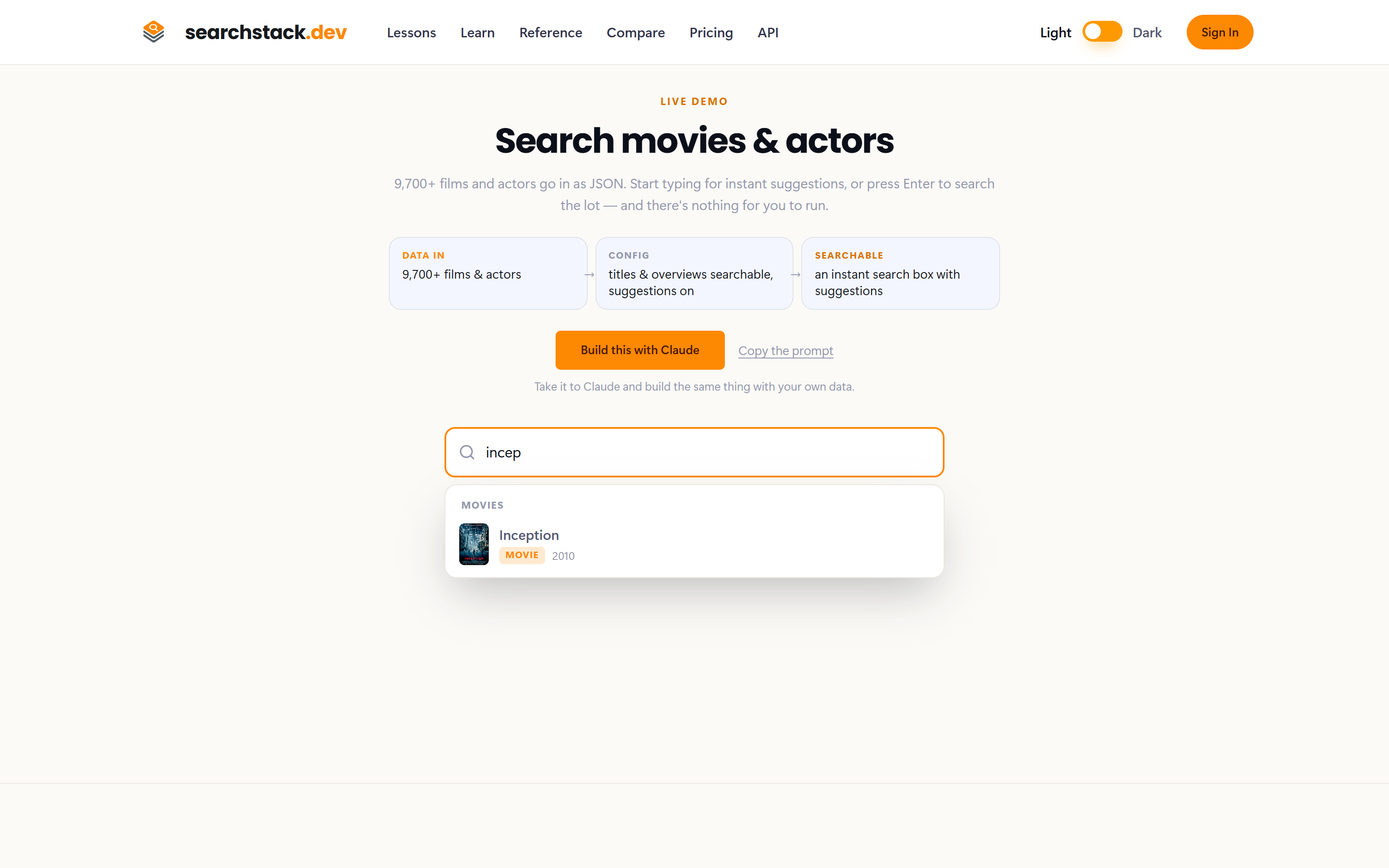
This is the module attached to a real list: a dropdown after every keystroke, arrow-key navigation, a grouped heading, and each row drawn by your own template — poster, title, kind and year here. Underneath it is only calling the suggest endpoint, so anything it does you can do from any language.
Try it
Live against a real movies list on the public API, on a read-only demo key and a custom template. Type “matrix”, “inception” or “dark”:
Install
From npm:
npm install @searchstack/autocomplete…or straight from the CDN, with no build step:
import { attachList, attachGroup } from 'https://cdn.jsdelivr.net/npm/@searchstack/autocomplete@2/dist/searchstack-autocomplete.js'Authentication
- Your API key is the required second argument to
attachList/attachGroup, sent asX-API-Key. - It ships in your page’s JavaScript, so make it list-scoped and read-only: scope A single list (or A single group), permission
search-result:read. - Such a key grants nothing else — no other list, no account settings, no writes. Changing the list name in the URL returns
403. - For a signed-in user instead, pass their
access_tokenin the options (sent asAuthorization: Bearer).
Usage
attachList targets one list, attachGroup a group. Both take the id of an <input>, an API key limited to suggest, your account name, the list or group name, and the version — for a group, 'latest' to follow its current version, or a number to pin one.
<input id="txt1" />
<script type="module">
  import { attachList, attachGroup } from 'https://cdn.jsdelivr.net/npm/@searchstack/autocomplete@2/dist/searchstack-autocomplete.js'

  // Target a List version:
  await attachList('txt1', 'YOUR_SUGGEST_KEY', 'my-account', 'my-list', 1);

  // ...or a Group, always tracking its current membership version:
  await attachGroup('txt1', 'YOUR_SUGGEST_KEY', 'my-account', 'my-group', 'latest');
</script>
Ask
attachAsk and attachAskLauncher arrived in 2.4.0; 2.4.1 fixes Ask on small screens, where the full-screen suggestion list covered the answer panel and swallowed the keys that open it. A missing named import stops the browser loading the whole module, taking attachList and your search box with it — so on a CDN pin @2.4.1, not the @2 range, which jsDelivr can serve stale for hours after a release.
attachAsk is attachList plus an answer: same suggestions, same speed, with an “Ask this” row beneath them that opens a panel over the page, writes the answer out as it is generated, and links back to every section it used.
- Opening it — click the row, ↓ past the last suggestion, end the query in ? (which pre-selects the row, so Enter answers), or Cmd-K. Otherwise Enter is unchanged.
- In the panel — a trailing ? starts the answer; ↓/↑ move through the cited and related sections.
- No search box (a home page, a footer) —
attachAskLauncher('element-id', { … })opens the same panel from any button, with no search key. Our own home page uses it.
await attachAsk('txt1', 'YOUR_SUGGEST_KEY', 'my-account', 'my-list', 1, {
  ask_endpoint: '/api/ask',
});- Suggestions go straight from the browser to the search API on the key above.
- The answer does not — it needs a model key, which must never ship in a page.
ask_endpointpoints at your own backend, which finds the records, calls the model, and streams the result back as server-sent events (sources, thendelta, thendone). - Citations are
[^1]markers matching a source’s marker, drawn as links to that section. Strip any marker your own search did not produce. - Styling — no branding, follows light and dark mode, restyled with the
--searchstack-ask-*variables. Full option list in the package README. - These docs run it — the sidebar box is
attachAsk. Press Cmd-K.
Custom row templates
Each suggestion shows its name unless you pass a template: a function receiving the record, returning an HTML string. Over a group, branch on data.list_name for a different row per list.
import { attachGroup, escapeHtml } from 'https://cdn.jsdelivr.net/npm/@searchstack/autocomplete@2/dist/searchstack-autocomplete.js';
import { fieldText } from 'https://cdn.jsdelivr.net/npm/@searchstack/public-api@4.4.0/dist/index.js';

await attachGroup('movies-actors-txt', 'YOUR_SUGGEST_KEY', 'my-account', 'movies-and-actors', 3, {
  template: (data) => {
    if (data.list_name === 'actors') {
      return `<div style="display:flex;gap:10px">
        <img src="${escapeHtml(fieldText(data, 'image_url'))}" style="width:50px" />
        <div><strong>${escapeHtml(data.name)}</strong><br><small>Actor</small></div>
      </div>`;
    }
    return `<div style="display:flex;gap:10px">
      <img src="${escapeHtml(fieldText(data, 'poster_url'))}" style="width:50px" />
      <div><strong>${escapeHtml(data.name)}</strong> <small>(${escapeHtml(fieldText(data, 'year'))})</small><br><small>${escapeHtml(fieldText(data, 'genre'))}</small></div>
    </div>`;
  }
});escapeHtml. The template’s string is inserted as HTML, so a record holding <img onerror=…> would run script on your page. escapeHtml also turns a missing field into an empty string.
fieldText, not data.genre. A facet always arrives as an array, however many values it holds: two genres print as Comedy,Drama, no space, and a one-value field like year only looks fine by accident. fieldText joins values properly, returns a single one as itself, and gives null rather than undefined for a field the record lacks; fieldValues gives the array, fieldNumber a number to compare. All three read a suggestion (flat) and a search hit (nested under fields) alike, and need @searchstack/public-api 4.4.0 or later.
Options
All optional, all passed in the sixth argument to attachList / attachGroup.
| Option | Default | What it does |
|---|---|---|
api_key | — | API key sent as X-API-Key. Supply this or access_token. |
access_token | — | A signed-in user’s token (JWT) sent as Authorization: Bearer. Supply this or api_key. |
base_url | public API | A different API address (regional, or self-hosted). |
delay | 200 | Milliseconds to wait after a keypress before calling the API. |
minimum_characters | 2 | Don’t call the API until this many characters are typed. |
suggestion_options | — | Extra suggest settings for the API: size, filter, radius, skip, cache. |
template | name only | Function (data) => htmlString drawing each row, desktop and mobile. |
headless | false | Fetch suggestions and fire the events / callbacks without drawing the list. |
history_template | template | Template for previously-selected (history) rows. |
allow_multiple | true | When false, attaching first removes any previously attached instances. |
footer_template | — | Function returning HTML added below the list. |
enable_history | true | Remember recent selections and show them first. |
enable_repositioning | false | Let the list move to the best fit (right / top / left) when it doesn’t fit below the input. |
full_screen_on_mobile | true | Open the list full-screen on mobile devices. |
mobile_max_screen_width | 500 | Screen width (px) at or below which mobile behaviour starts. |
full_length | true | Make the list the same width as the input. |
list_style / list_item_style / history_item_style | — | Inline CSS for the list / each row / each history row. |
selected, suggested, search | — | Event-handler functions; the same signals fire as DOM events. |
selected_failed, suggested_failed | — | Handlers receiving a status and message when a call fails. |
Events
The component also fires DOM events on document:
| Event | Fires when… | What it carries |
|---|---|---|
searchstack-suggestions | suggestions come back | e.data, e.query |
searchstack-search | the user submits a search | e.query |
searchstack-selected | a suggestion is chosen | e.data, e.id, e.query |
searchstack-suggestions-failed | a suggest call fails | e.status, e.message, e.query |
searchstack-selected-failed | looking up a chosen suggestion fails | e.status, e.message, e.id |
document.addEventListener('searchstack-selected', (e) => {
  console.log(e.id, e.data);   // navigate to the chosen record, etc.
});
Theming with CSS variables
Set these on the input’s container (or :root) to restyle the dropdown without touching its HTML:
| Variable | Default | Controls |
|---|---|---|
--searchstack-list-background-color | #fff | Dropdown background. |
--searchstack-list-font-size | 0.9em | Suggestion text size. |
--searchstack-list-item-background-hover-color | — | Row background on hover. |
--searchstack-list-item-background-focused-color | — | Row background on keyboard focus. |
--searchstack-list-*-margin-* | varies | Fine margins on each edge (top / right / bottom / left). |
There is a per-edge margin variable for every edge (--searchstack-list-top-margin-left, …); set only the ones you need.
Full-screen on mobile
The default. Set full_screen_on_mobile: false to keep the dropdown under the box everywhere.
await attachList('txt1', 'YOUR_SUGGEST_KEY', 'my-account', 'my-list', 1, { full_screen_on_mobile: true });